Have you ever heard of Pantone color? A universal language of color for designers, brands, and manufacturers.
A pantone color chart shows a review of standard colors according to the Pantone color reproduction system, a mostly normalized color reproduction system. Many industries, usually printing, although sometimes in the manufacture of fabrics, plastics, and colored paint, use the color space.
Time waits for no one, now, let’s get into deeper about all these things about color & hats!!

Photo by Mika Baumeister on Unsplash
1. What is Pantone Color?
First, let’s have some idea of the pantone color system.
In 1963, a little known printing company called Pantone Inc. revolutionized the game with the world's first color matching system. This system was developed by part-time employee, Lawrence Herbert.
At the time, Herbert was coming into printing to make extra money to pay his way through medical school. However, he had a knack for the industry and a passion to improve the current system.
After years and years of hard-working, he became famous and well-known. Almost all forms of advertising rely on the Pantone Matching System (PMS) for their colors. For example, colleges and universities use Pantone colors to print an exact color match for logos, mascots, and school names.
· What is the difference between Pantone and RGB?
RGB stands for “red, green, and blue.” An additive color model that reproduces a broad array of colors by combining different intensities of red, green, and blue light.
RGB is the foundation for many colored display output devices such as computer monitors, televisions, and displays on mobile phones.
The huge difference between Pantone and RGB is that the former one can provide a standardized system for color identificationand matching, while RGB is an additive color model primarily used for digitalformats. That’s the key difference.
· Can you convert RGB to Pantone?

DNS Checker

QconV

Code Amaze
Yes for sure!! RGB color model is an additive color model, which means the more value you add, the more you get closer to white. In PMS, each shade contains three or four digits numbers followed by C (coated), U (uncoated), and M (matte). These variations help in deciding how the color is displayed on these papers.
Simply put, RGB to Pantone conversion is essential for converting a digital image to a printing form.
To convert the RGB to Pantone, perform the following steps.
· Open the RGB to Pantone online converter.
· Please enter the Red, Green, and Blue values in their provided sections.
· You can also refer to the "color palette" for the possible close selection of the required color.
· From the dropdown, select "Distance" value (16, 32, 48, 64, 80, 96).
· The RGB to Pantone converter tool will display the results depending on the selected values. Use DNSCHECKER[1], also the tools above can achieve this.
· How do I match CMYK to Pantone?

One use of the Pantone color matching system is standardizing colors in the CMYK.
CMYK acronym stands for Cyan, Magenta, Yellow, and Key. Colours used in the printing process. CMYK is also a process of printing color using four inks. It can be used to produce a subset of unique Pantone colors.
Convert CMYK to Pantone with this tool[2]. All you have to do is select your color to generate the name in Pantone and match codes.
Steps are below:
1. Input your color codes in any field in color model area
2. The color code converter will show results in the Color Codes section
3. The colour will be converted to the equivalent Pantone code
2. How to Find Pantone Color in Illustrator?

Using Adobe Illustrator as an example to find your Pantone Colour Reference
To find it easily go to Window menu and open up the Swatches palette.
Here click on the menu icon on the top right corner of the palette and look for New Color Swatch.

There you will see the Pantone books under the Color Mode. There are a bunch of them listed there: Coated, Uncoated, Metalic, Pastel colors and so on.
If you don’t know which color books to use please refer to the Pantone color guides on www.pantone.com[3] or if you are working for a client simple ask them the Pantone colors of their logo for example. When you have the Pantone colors all you need to do is select the object on your artboard and give it the right Pantone color.

When you export your artwork pay attention to indicate the Pantone colors you were using to the printing company, so they will use the same colors in the printing process.
Some people may say that YinMn blue is the most beautiful colour in the world, it’s so bright and perfect that it almost doesn’t look real. It’s the non-toxic version of the world’s most popular favorite color: blue. Some people are calling this hue the best color in the world.
3. How Do I Use Pantone Colors?

Photo by Pawel Czerwinski on Unsplash
Pantone colors bring precision to manufacturing, design, and textiles. With these colors, it is perfectly clear what color you are
getting, and it is easy to verify with a Pantone swatch and the associated Pantone number.
· Color & Fashion
“A girl should be two things: classy and fabulous.” ― Coco Chanel.
Fashion is an industry, fashion is love, it's a way to call out people's inspiration. Color is a wonderful design for people to feel this world. Back to its history and all, it's beyond what people can say.
It’s love, life, also a way of living, that’s why we need color for headwear[4], for your love and life. A bride wears white on her wedding day, a grieving family wears black to a funeral, red doors are supposed to bring good luck, and a red dress may just give you the spice you need on a first date.
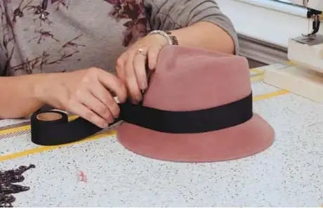
· Use Pantone for hat design
A person carries off the hat. Hats are about emotion. It is all about how it makes you feel.
——Philip Treacy
Hats is a great tool for fashion, and fashion designers would like to use the Pantone color system to create the colour range for their latest collections.
The question is how to use. Well, what is the simplest is the best.
You can see color everywhere you go, you travel, you walk on the street, you see different people and different tools, wherever you go, wherever you see, as long as you have an eye, you can see and identify different color.
With a white hat, then with a tool, any color or pen, then draw, make it different…and done!
Grab a pen and go, no other secret.
4. What Is the Pantone Color of the Year?

Photo excerpted with permission from Polygon1993 and V&A Paintings Gallery. Images (left to right): Reaching Into the Unknown, SONZAI
PANTONE COLOR OF THE YEAR 2022
PANTONE 17-3938 Very Peri
A New Pantone Color Whose Courageous Presence Encourages Personal Inventiveness And Creativity.
PANTONE 17-3938 Very Peri, a symbol of the global zeitgeist of the moment and the transition we are going through.
It's warm and friendly blue hue with a carefreeconfidence and joyful attitude, emboldens uninhibited expression and experimentation. Displaying a dynamic presence, Very Peri is an enthusiastic bluehue whose whimsicality lends it self to unpredictable color harmonies andspontaneous color statements.
As we emerge from an intense period of isolation, our notions and standards are changing, and our physical and digital
lives have merged in new ways.
“Encompassing the qualities of the blues, yet at the same time possessing a violet-red undertone, PANTONE 17-3938 Very Peri displays a spritely, joyous attitude and dynamic presence that encourages courageous creativity and imaginative expression.” Probably that’s what makes this color unique.
In summary, this color is magical and brilliant, so definitely would be great to be utilized in both hats design and your daily life.
Conclusion
“In nature, light creates the color. In the picture, color creates the light.” – Hans Hofmann
“Light is a thing that cannot be reproduced, but must be represented by something else – by color.” — Paul Cezanne
"Fashion was not only supposed to make women beautiful, but to reassure them, to give them confidence, to allow them
to come to terms with themselves." (Yves St. Laurent)
"Life is like a new hat. You don't know if it suits you if you keep trying it on in front of your own mirror." — Shirley McLaine
Color is magical, hats are magical, when these two are combined together, life becomes different. And that’s the key of living.
To believe in sunshine, to believe in difference, to believe fashion and hold the breath for every wonderful way of life.